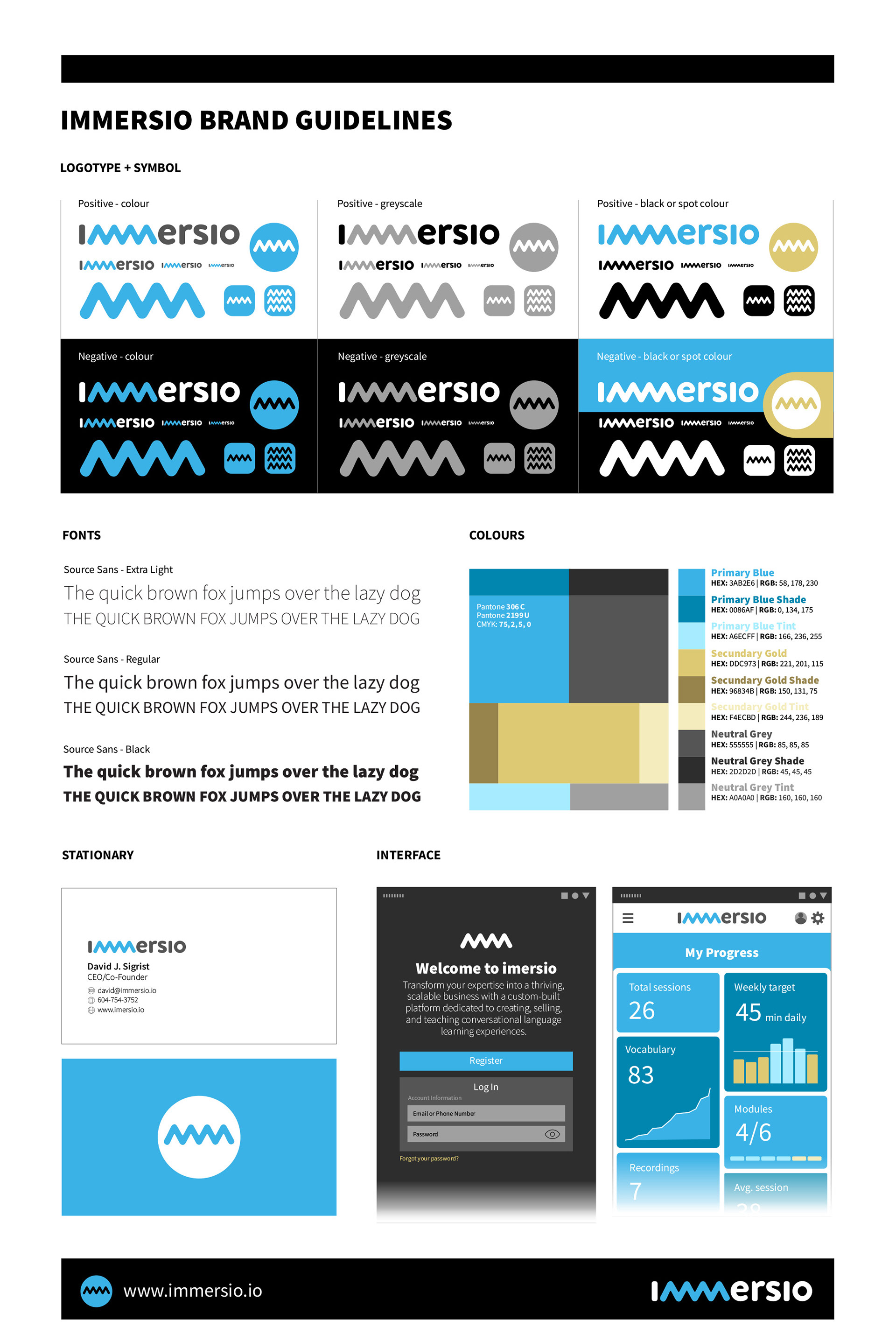
New logo, symbol, and brand guidelines for the language learning platform Immersio.
Year: 2023 || Client: Immersio Learning Inc. || Art direction and design: Sergio Toporek

The original Immersio logo was designed in-house, and while it served its purpose during the initial research and funding phase of the project, it presented serious design inconsistencies and reproducibility issues. The uneven kerning affected its legibility, the "e" and "s" glyphs presented abrupt Bézier curves, the use of color lacked purpose and contrast, and the irregular and sharp serifs gave it a somewhat aggressive presence. There was no distinct symbol, or clear identity guidelines.
It became evident that it was time for Immersio to adopt a more professional and intentional visual identity.

After conducting a morphological study of the name, it became clear that its most distinctive feature is its sequential double "m" repetition. Considering that Immersio is one of the few language learning platforms that features extinct, I conducted an exploration of the ancient origines of the letter M. In a fortunate coincidence, we discovered that the multiple incarnations of the M glyph, from the ancient Phoenician to the modern Latin, evolved from the ancient Egyptian hieroglyph representing water. This symbol fits the concept of immersion perfectly.
The challenge now was to adapt the research to a modern, friendly, and streamlined visual identity.
The new Immersio logotype features a modern and rounded version of the ancient Egyptian hieroglyph for water that also represents the double M. It is integrated from conception to a friendly, rounded, open, and geometric lowercase word.
The visual identity is based on the new logo, which provides the double M symbol as an independent graphic element. The primary color of the new visual identity is a blue that is based on the original water hieroglyph. The secondary color is based on on the papyrus and clay tablets where hieroglyphs were traditionally inscribed. The palette is completed with the neutral gray used on the logo. All three colors can be used as tints, shades or tones.
The correct uses of the logo and graphic elements in a variety of situations have been clearly defined.
The font selected for all communications is Source Sans in all its different weights.
The font selected for all communications is Source Sans in all its different weights.